In 1998, I started my own freelance Graphic Design business. It began with a desire to spend more time with my two young children and to have more freedom to volunteer at their school. It was a scary thing to do, but as with most things in my life, I jumped in with both feet and prayed for the best. When I quit my job, my boss wouldn’t let me leave or tell anyone that I'd quit. So for two months I walked around trying to figure out how this thing would play out. Then one morning in a staff meeting, they announced that I was leaving! I don’t know how many days it was, but I had a very short time to get my act together to start getting business.
That night I put together a logo and some “fake” business cards so I could go meet with some people the next day. I’d been considering the name Mighty Mouse from a nickname I had, so with no further thought, I put a cute little mouse holding up a computer on the page with the name and that was seriously my logo for the next 6 years.
A Logo Designer is Born
I had no real plan to focus on logo design, because my experience was mostly in page layout and production. However, one of the last jobs I'd done at the agency was a logo for Soby's Restaurant. That one logo got a lot of attention in my portfolio, so more logo design projects started coming in. I quickly remembered that this was what I wanted to focos on.
Over the next 10 years I would have the opportunity to design 100s of logos. But always at the back of my mind was, “My logo is really NOT good!” So every few years I would take a stab at "fixing it". But putting a band-aid on your logo rarely ever works (see logo progression). I needed a completely new design. Funny how we don't want to work on our own stuff. It's especially hard for a designer to design for themselves! So I just kept plugging away at other people’s work and never really took my own branding seriously (the cobbler's children have no shoes!).

Then, two years ago I got out of my home office and started working at this wonderful space in Greenville called CoWork. I was suddenly surrounded by lots of young eager professionals including other designers. I felt exposed and worried that I wouldn’t measure up to the current design trends. Then to confirm my fears, I got a sweetly written email from a coworker suggesting that I might want to think about redoing my website. In other words: “Your website sucks and we’re embarrassed!” No, they didn’t say that, but I knew it was true. So I was forced to take that step back and take a hard look at my own branding and marketing. It was one of the hardest things I’d done in a while. It's very hard to put the brakes on and work on your own business. So I made the decision to put some work on hold to get this done. In working through the process of redoing my website, as wonderful thing happened... I got inspired to redesign my logo. I don’t always know when inspiration will come, but I'm always happy when it shows up! At the end of the day I realized it was time well spent.
It All Starts with a Name
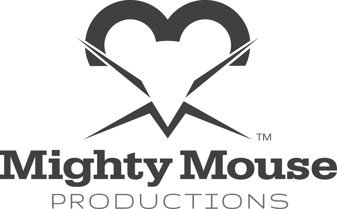
I know my name is unusual and really not trademarkable (is that a word?) because of the Mighty Mouse cartoon franchise. However, the name stuck with me and it suits me, so I decided to keep it. Plus, I had 16 years of equity in it and a lot of local recognition as Mighty Mouse. So with the name Mighty Mouse, I wanted my icon to be clean, simple and not cute and cartoon-like. I wanted something that was also very clever, because after all, I AM a logo designer (no pressure there)! One of the best things a logo icon can do is offer several different things to see when you study it. Icons can be like puzzles, complex ideas with simple solutions.
The first thing you'll probably see In my icon is the mouse head in the white space. Working with white space is difficult and doesn't always work. Next, I wanted the design to look alive and active, so I gave the mouse very sharp and pointy whiskers. The inspiration for that came from the previous design where the original mouse has his arms up. The last thing you should notice are two “M”s for Mighty Mouse at the top and bottom. The simplicity of this design was powerful to me that I made the decision to leave it black and white. Color should always be secondary to design and I change what colors I like so much I felt this would be a comfortable place to stay.
After rebranding myself, the website fell into place. It was as I said time well spent and it gave me a lunch pad for designing the website. A good logo and nice photography or illustrations are the two components necessary for good design.
So I have to ask you: have you taken a step back and evaluated your brand?